Tutor Orial / Sign Up Flow
Re-designing a sign up flow to increase customer retention and conversion
Problem
How might we redesign the user flow to ensure high customer retention?
How might we redesign the user flow to ensure high customer retention?
Outcome
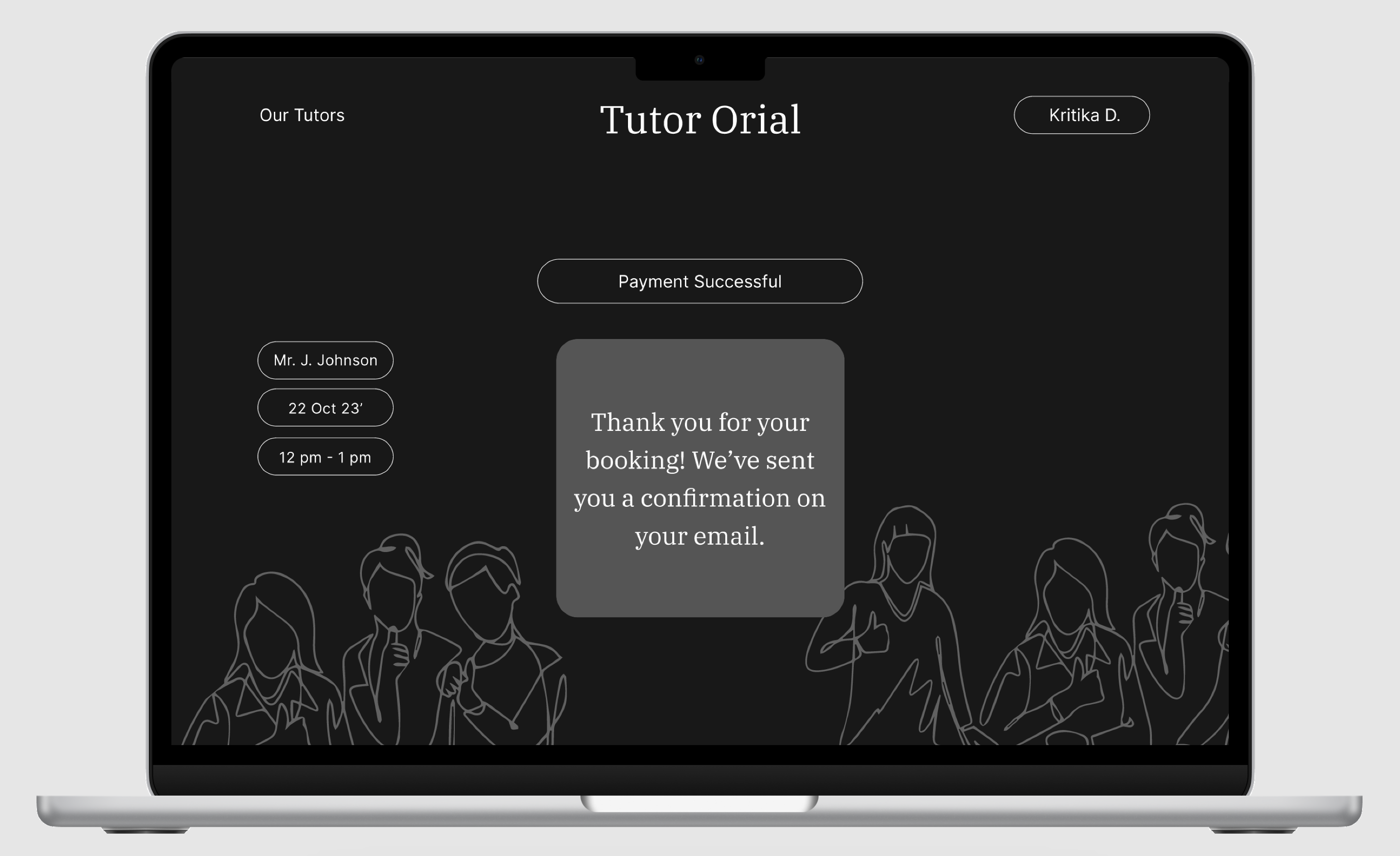
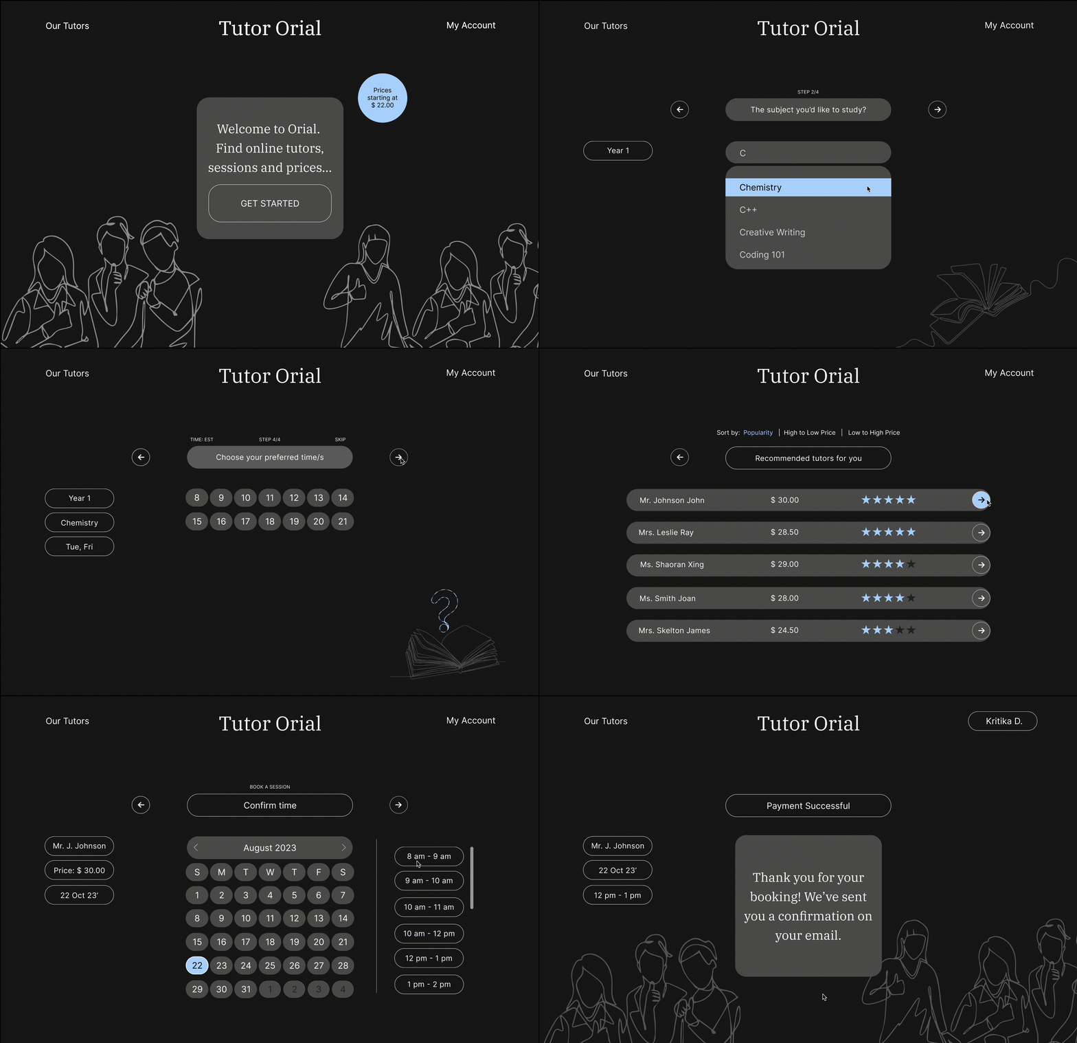
I re-designed a sign up flow for booking an online tutor session.
I re-designed a sign up flow for booking an online tutor session.
Role
UI UX designer
UI UX designer
Audience
High School Students
High School Students
Timeline
4 Weeks
4 Weeks
Software
Figma
Figma
Context
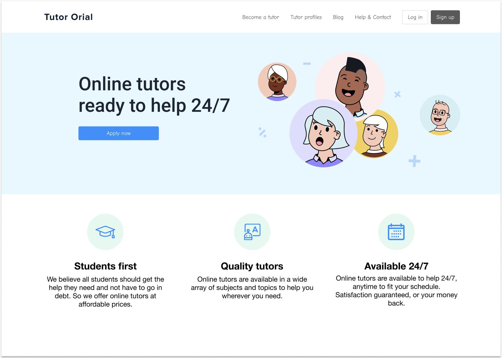
Tutor Orial is an online tutoring agency for high school students. They have a wide variety of subjects that are tutored and many tutors to choose from.
The current website not only was badly organised but also faced a lot of uncompleted booking transactions and thus, a loss of customers and sales.
Tutor Orial is an online tutoring agency for high school students. They have a wide variety of subjects that are tutored and many tutors to choose from.
The current website not only was badly organised but also faced a lot of uncompleted booking transactions and thus, a loss of customers and sales.
Redesigned Tutor Orial Sign Up Flow
PROCESS
01
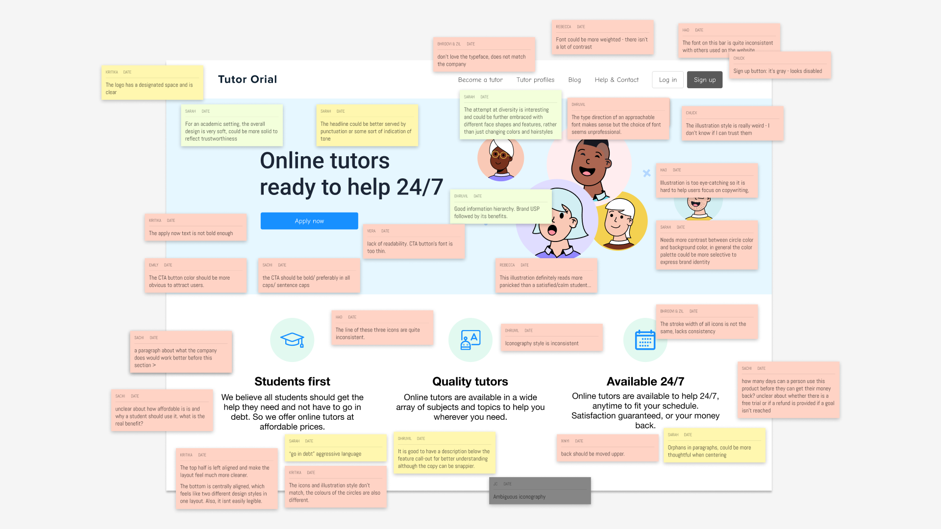
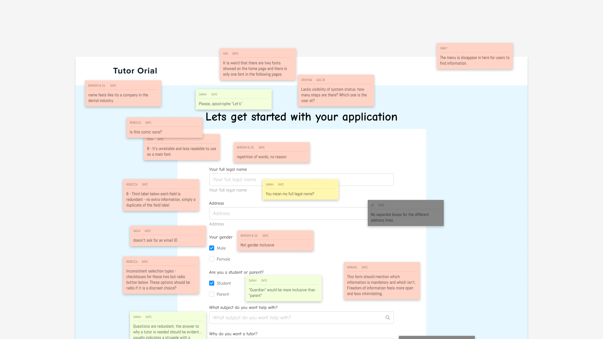
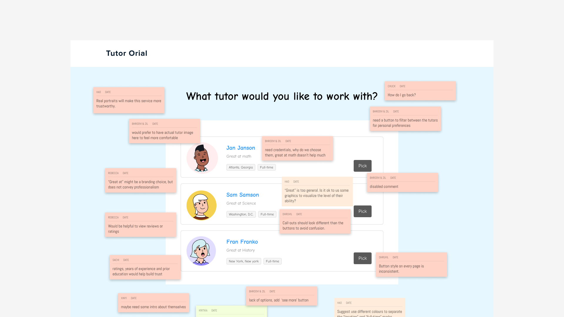
Here we studied the existing website in detail—evaluated the user journey and content.
Heuristic Analysis
Here we studied the existing website in detail—evaluated the user journey and content.


02
Even though there were many areas that could be improved, I prioritized the main issues to be solved first given the timeline of the project.
Key Insights ︎︎︎
Even though there were many areas that could be improved, I prioritized the main issues to be solved first given the timeline of the project.
#01
No Visibility Status
The process of booking needed clarity in the number of steps and user flow.
No Visibility Status
The process of booking needed clarity in the number of steps and user flow.
#02
More information would give the user clarity to make better choices.
Lack of Information
More information would give the user clarity to make better choices.
#03
The branding felt outdated and boring and definitely needed refinement.
Lackluster Brand
The branding felt outdated and boring and definitely needed refinement.
03
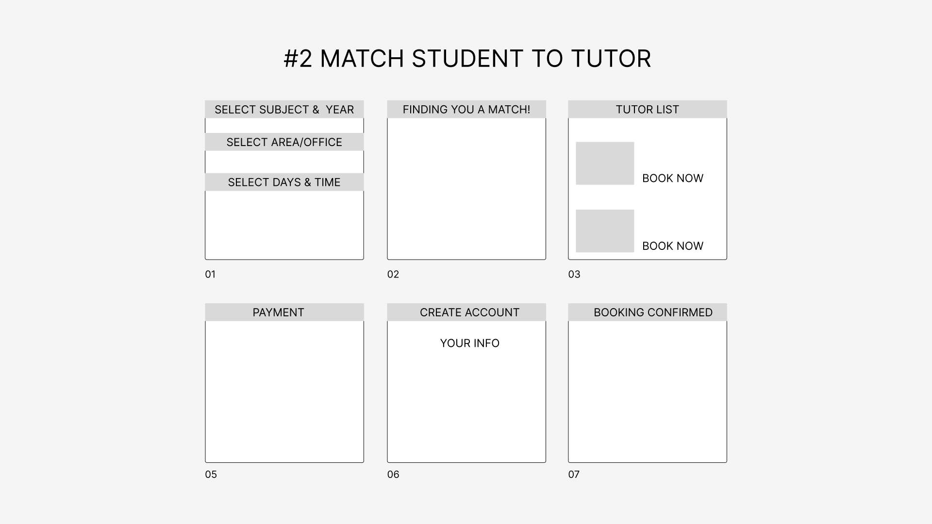
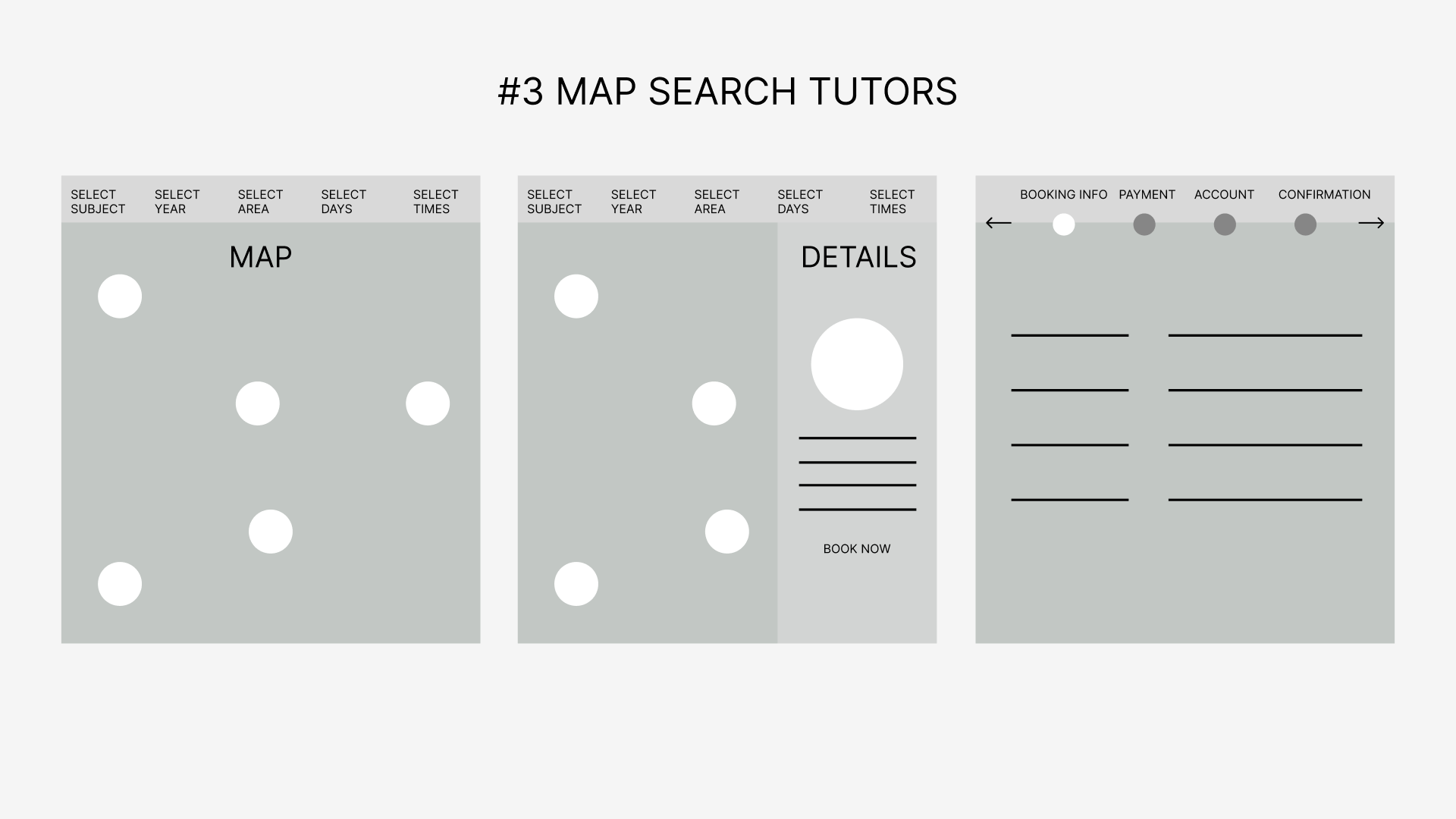
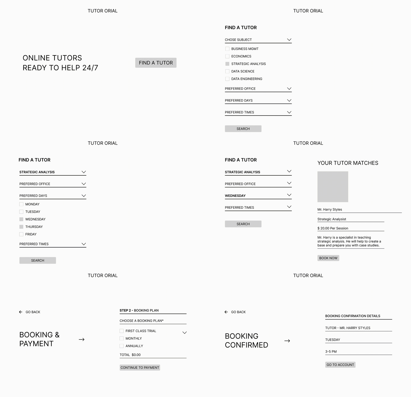
I sketched some solutions keeping in mind the need for a clear step by step user flow.
Sketching Solutions
I sketched some solutions keeping in mind the need for a clear step by step user flow.

04
I sketched some solutions keeping in mind the need for a clear step by step user flow.
Testing Lo-Fi Prototypes
I sketched some solutions keeping in mind the need for a clear step by step user flow.
05
Key Testing Insights
01
“Asking all the questions at once feels like a lot, breaking it up would make me feel less overwhelmed”
“Asking all the questions at once feels like a lot, breaking it up would make me feel less overwhelmed”
02
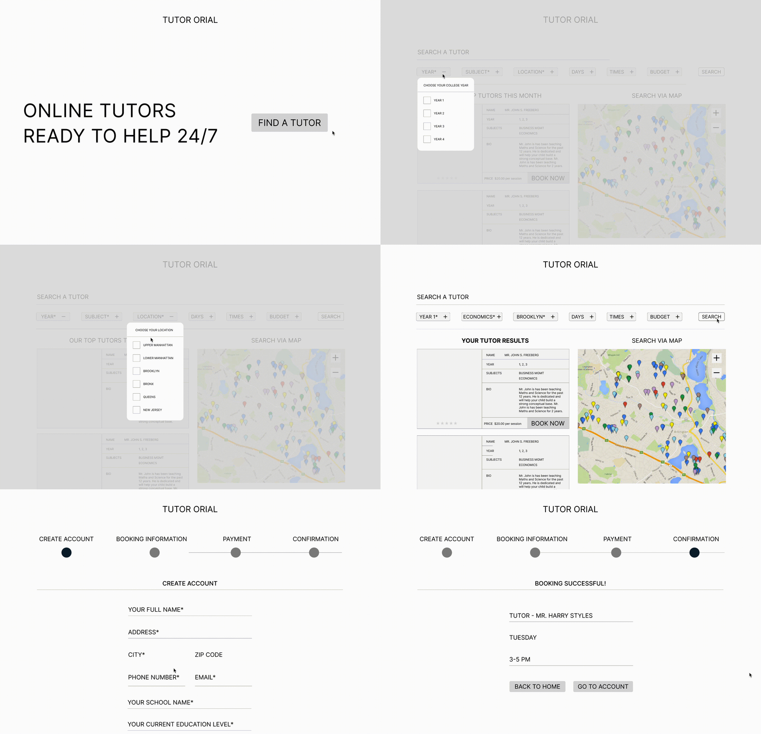
“I’m not sure if the map view helps a lot since I the information on the tutor is much more important.”
“I’m not sure if the map view helps a lot since I the information on the tutor is much more important.”
06
Design System

Focus on each step
One step at a time helps users focus easily and 1/4 helps to reduce any overwhelm.

Best Tutor Matching

Clear tutor details
The site features price, rating and sort by options clear and upfront to ensure transparency and clarity.

Easy Booking


Reflections
This project was challenging in terms of deciding on the most clear user journey. It was really fun to experiment with the map idea. I wish I hadn’t given up on that so easily but I do like the simplicity of booking in the final design. Looking back, I wish I had made the brand look more vibrant instead of old school.