LOV / Typeface Design
A law of vibration typeface
About
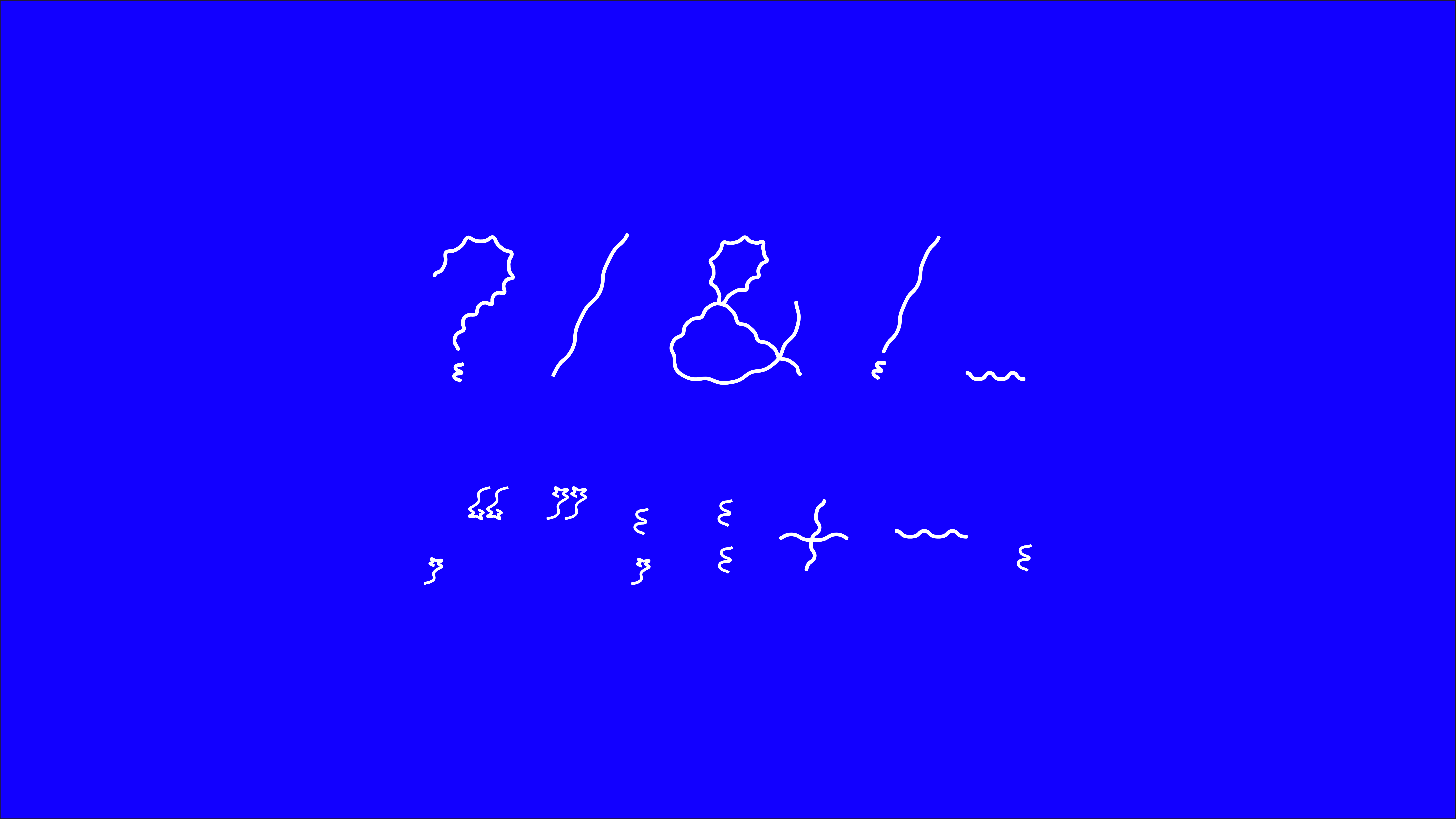
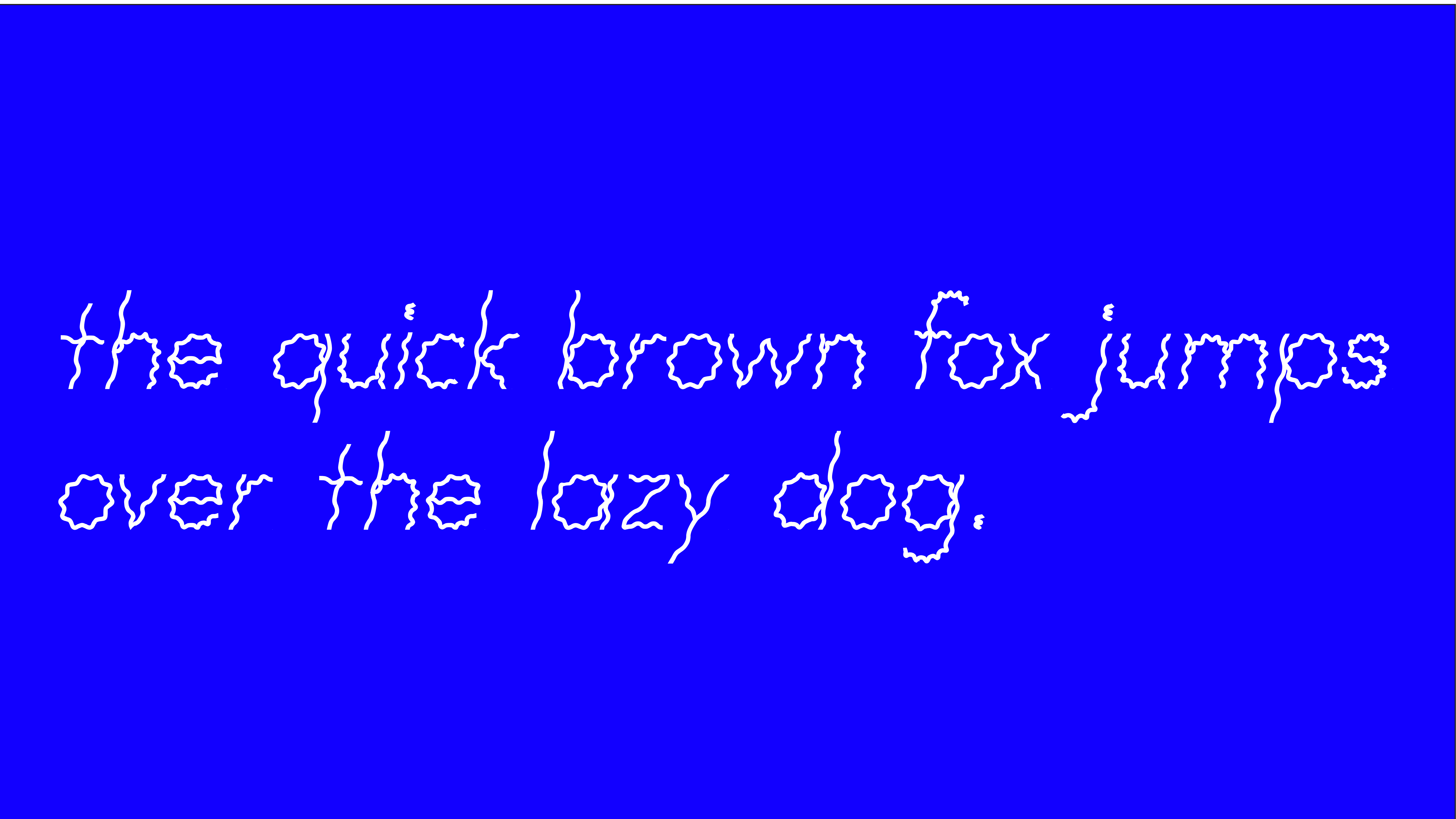
LOV is a display typeface, made for headlines or large text paragraphs.
The inspiration behind this font is the ‘law of vibration’ which posits that everything in our universe is under constant movement and nothing is really solid, like it looks. Thus, in this project, my aim is to create a static font that looks like in motion.
LOV is based on an italic and thin line font style. It a sans serif handwritten font that has been drawn out through a combination of wavy and curvy lines. It has a regular width and a medium x-height, which makes it legible even at a distance. It’s rounded corners and moderately open letter style create a friendly vibe. As of now, it has only been created it in small letters and one weight.
Get This Font
If you’d like to get this font, please send an email on kritikadhariwal08@gmail.com for details.
If you’d like to get this font, please send an email on kritikadhariwal08@gmail.com for details.
Role
Typeface Designer
Typeface Designer
Timeline
2 Months
2 Months
Software
Fontlab Studio
Fontlab Studio
Files
OTF, TTF
OTF, TTF
LOV Typeface


