Access Behavior Analysis / Website Design & Development
Goal A
An e-commerce website launch creating differentiation
Goal B
Ensuring effortless maintenance for clients through streamlined development.
Problem
How might we imagine an online ABA therapy company so that it feels more light-hearted, emanates safe healing and is user-friendly?
How might we imagine an online ABA therapy company so that it feels more light-hearted, emanates safe healing and is user-friendly?
Outcome
I developed an engaging interface while prioritizing usability to ensure a seamless experience for users. A lot of effort went into ensuring that the website followed the set brand style and was able to stand out through details.
I developed an engaging interface while prioritizing usability to ensure a seamless experience for users. A lot of effort went into ensuring that the website followed the set brand style and was able to stand out through details.
Role
Lead designer
Lead designer
Team
1 Designer, 2 Developers
1 Designer, 2 Developers
Software
Figma / Next.js /Strapi CMS (Node.js) / Mysql
Figma / Next.js /Strapi CMS (Node.js) / Mysql

Context
ABA therapy is given to special needs children to make them independent and empower them.
The client required an online clinic for 3 services:
This project delivers the first service from above.
ABA therapy is given to special needs children to make them independent and empower them.
The client required an online clinic for 3 services:
- Provide recertifcation CEU courses for current ABA therapists
-
Provide ABA therapy service for clients
- Create a team of ABA therapists in USA.
This project delivers the first service from above.
Impact
*Created a future-ready e-commerce site that stands out among 100+ US ABA therapy websites offering online courses in 2022.
*Designed 10+ user-centric website features; including quick view and certificate generation—boosting user convenience at every interaction.
*Built a robust design system that streamlined cross-team collaboration, cutting creative turnaround time from 5 days to 2.
Final Website
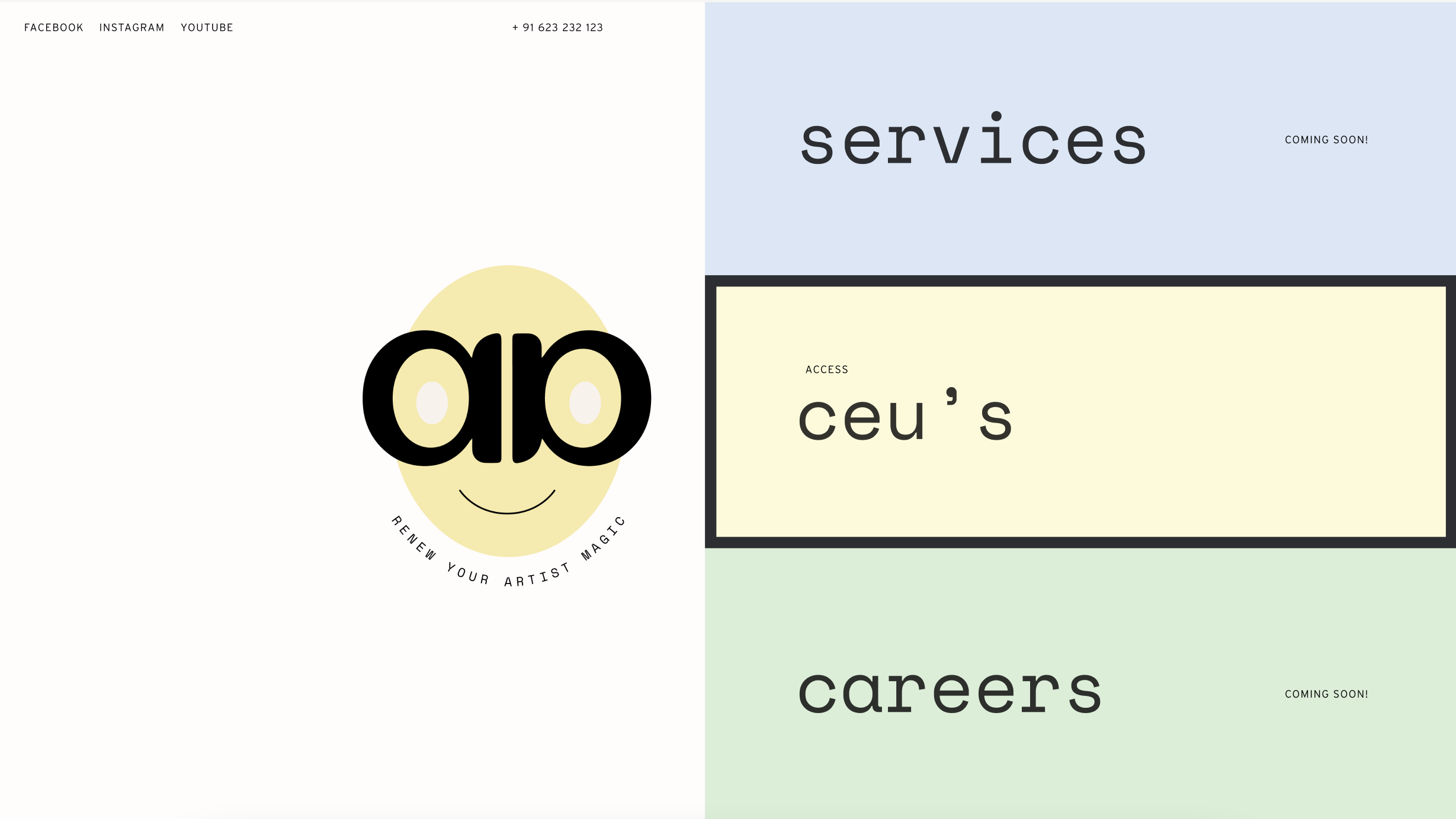
With a lot of iterations, user tests and client collaboration, we designed and developed an e-commerce website, unlike any other in the current market.


Mobile Responsive
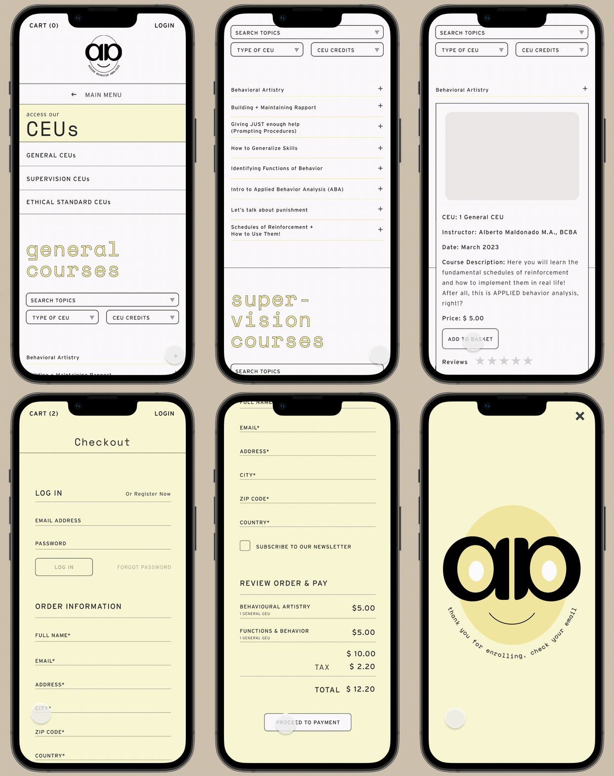
This website was built with mobile first approach, where we designed this UI before the desktop or tablet sizes.


#UI
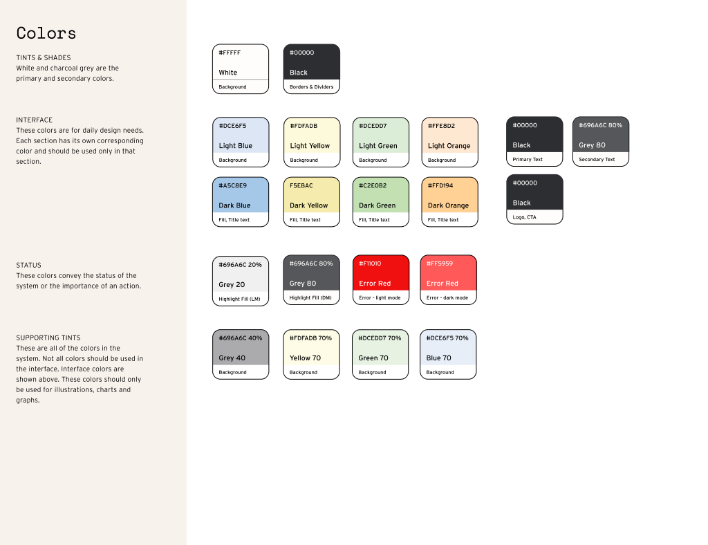
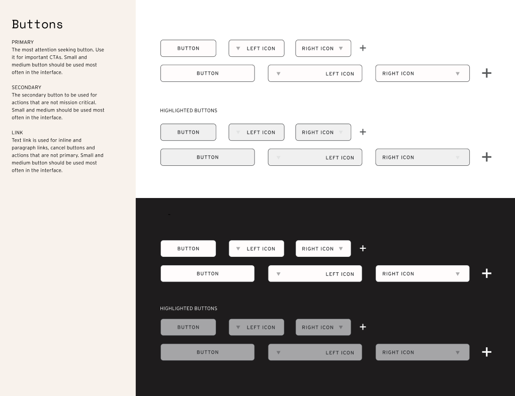
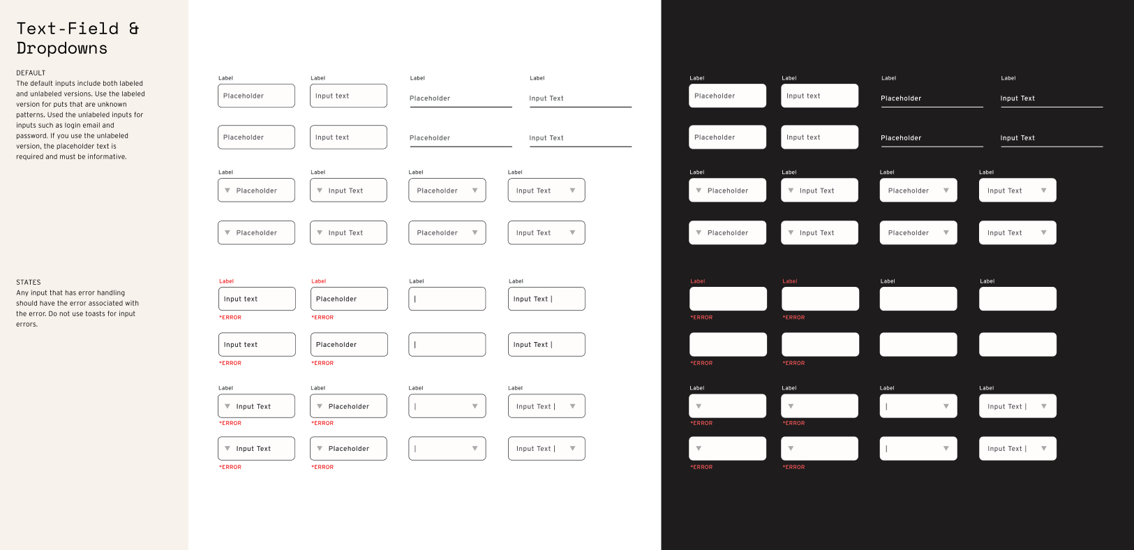
From creating an interface typescale to colors, buttons and defining text-fields and dropdowns, I created this detailed design system.
Robust Design System
From creating an interface typescale to colors, buttons and defining text-fields and dropdowns, I created this detailed design system.

#UI
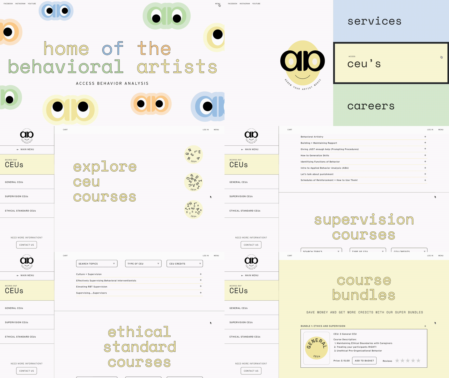
Delightful Brand Illustrations
The website uses illustrations and playful language throughout the site to ensure delight and surprise.
Delightful Brand Illustrations
The website uses illustrations and playful language throughout the site to ensure delight and surprise.


PROCESS
01
Market and Competitor Research
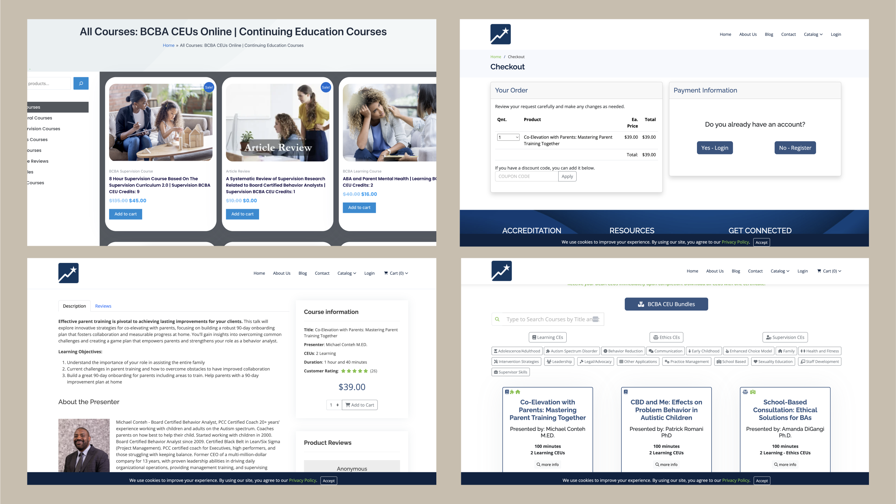
First was understanding client goals, research the existing competitors, understanding the user journey. Here I realised that there was a lot of potential for standing out via the power of visual design since the process of booking a course was fairly similar.
Market and Competitor Research
First was understanding client goals, research the existing competitors, understanding the user journey. Here I realised that there was a lot of potential for standing out via the power of visual design since the process of booking a course was fairly similar.
02
Ideation & Sitemap
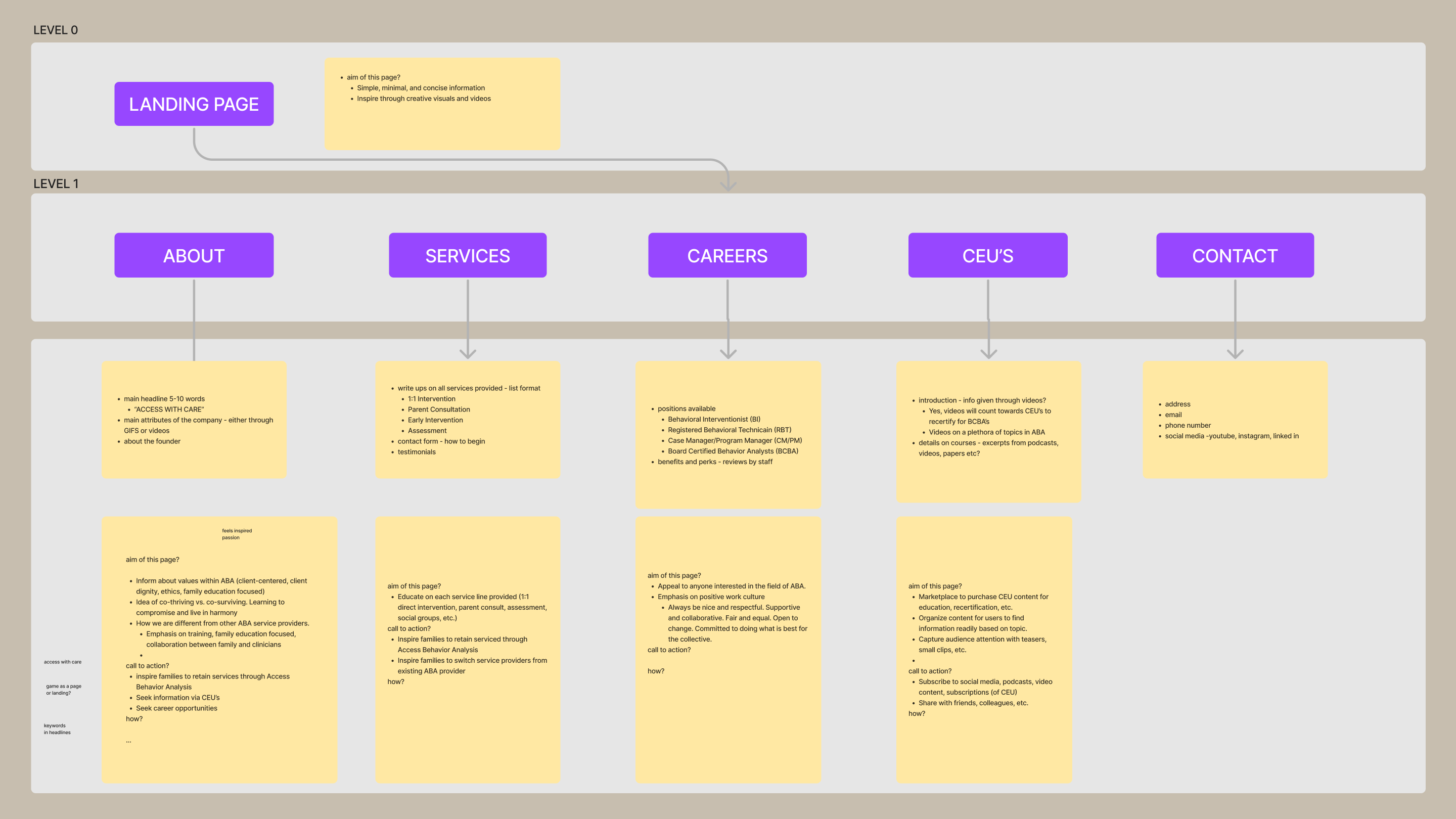
Based on the research and findings, I created a hierarchy for information architecture of the entire website and also for specific pages. I tested a few versions of these with the clients and refined the sitemap to reach an optimal solution.
Ideation & Sitemap
Based on the research and findings, I created a hierarchy for information architecture of the entire website and also for specific pages. I tested a few versions of these with the clients and refined the sitemap to reach an optimal solution.

03
Wireframes & Prototyping
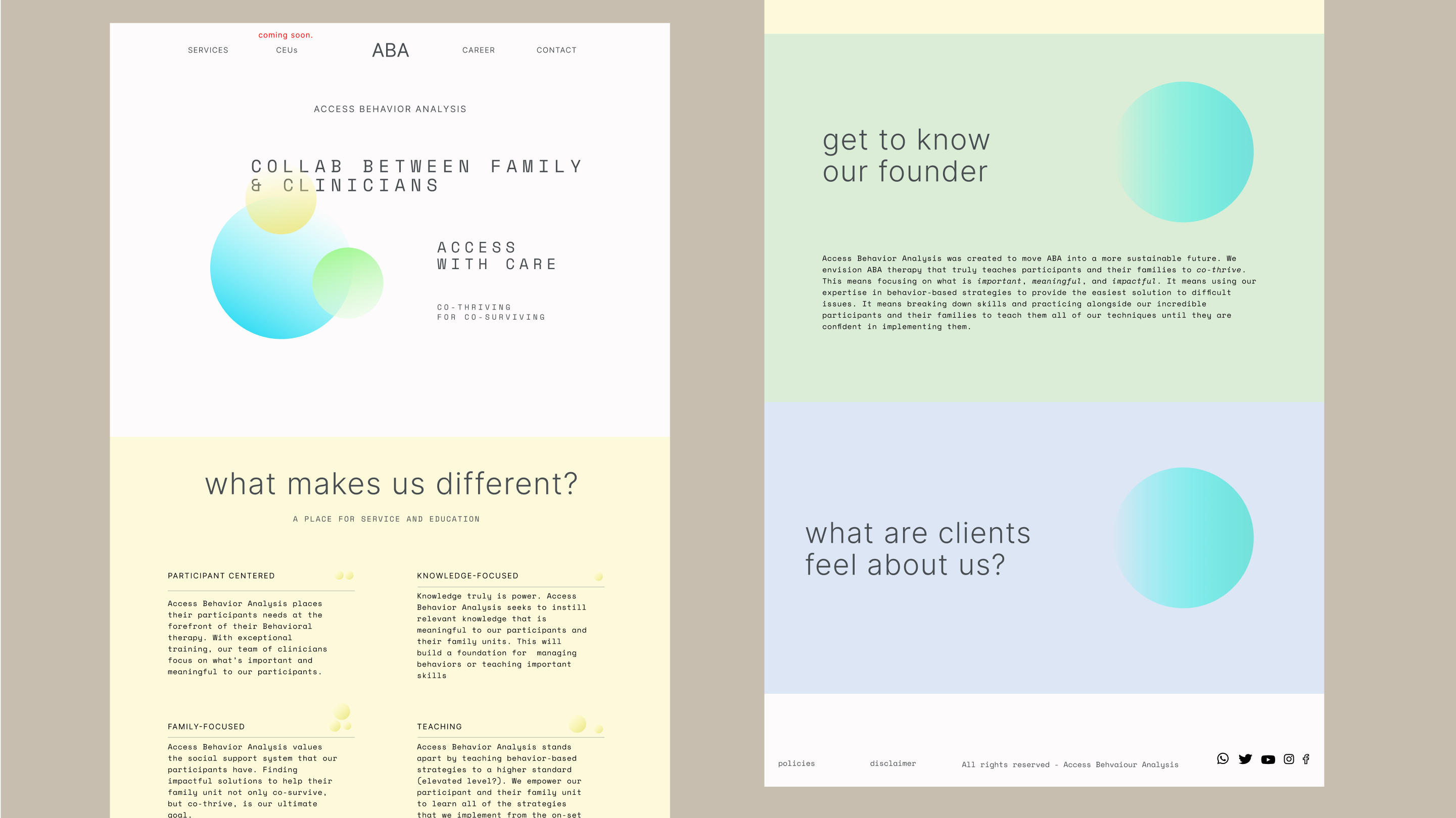
Next was sketching out each of the pages by considering the information hirearchy and the goal of the page.
I did a round of A/B testing to see which layout worked better for the users to know more about the courses.
The list style menu was the clear winner and so we chose to go with that. It was also easily adaptable on the mobile.
After this, I created mobile first prototypes them and adpated the design to a desktop size.

04
We did 2 rounds of testing with 5-6 potential users each to ensure that the users found it easy to navigate the site, courses, dashboard and access the courses.
User Testing
We did 2 rounds of testing with 5-6 potential users each to ensure that the users found it easy to navigate the site, courses, dashboard and access the courses.
- 95% of the users enjoying the straightforward and refreshing UI in the first round of testing itself.
- 67% of the users found it intuitive to move through the booking flow after the first round of testing, so we ensured to add more defined error fields when logging in or cues to Sign up for first time users. On the second round of testing, 100% users felt it very easy to book.
- 50% of the users did not understand that the ‘+’ opens the course details immediately and so we decided to make an onboarding screen where the users would get a 2 step navigation guide on entering the site for the first time.
- The clients found it very easy to update the course list on Strapi (the platform we chose to use) and felt confident in their ability to maintain it.
#Feature 01
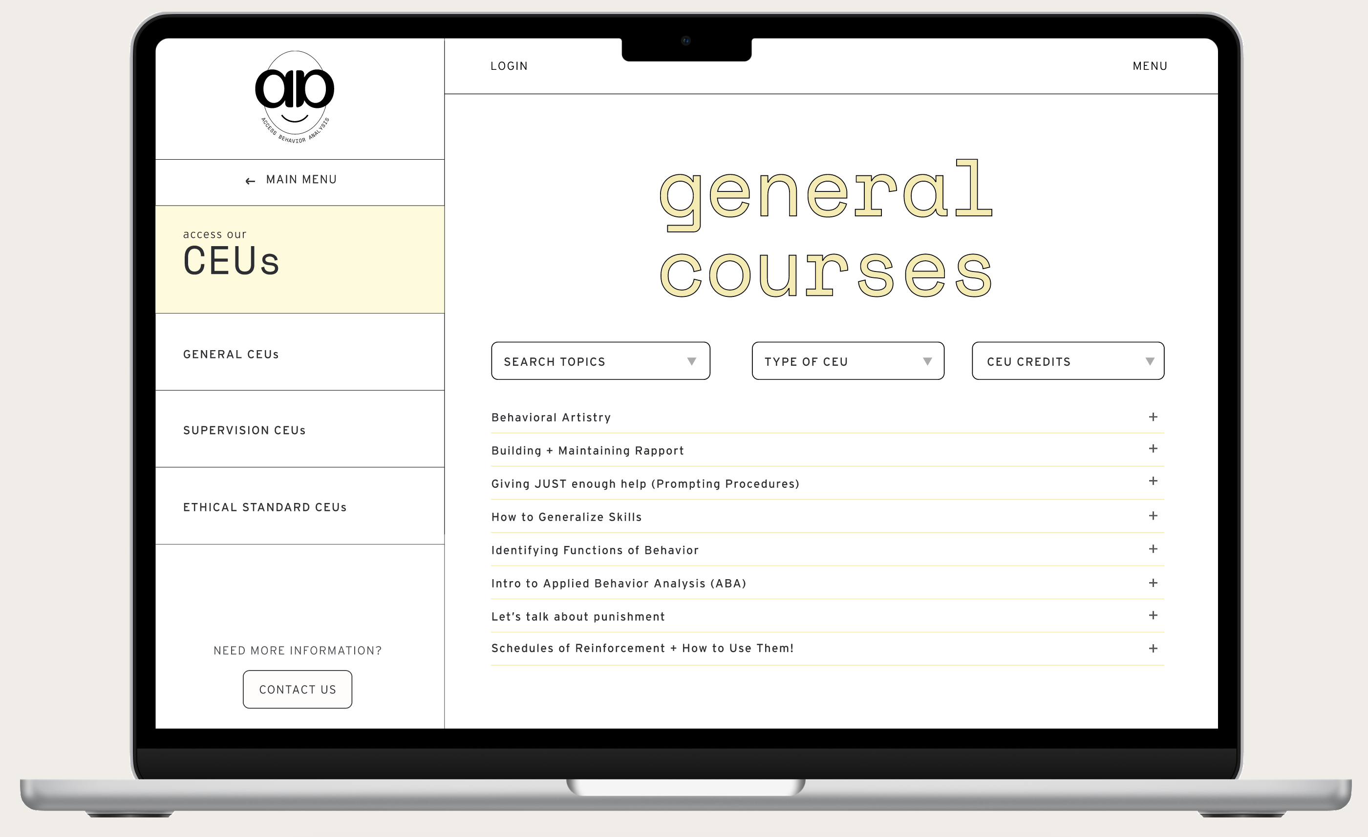
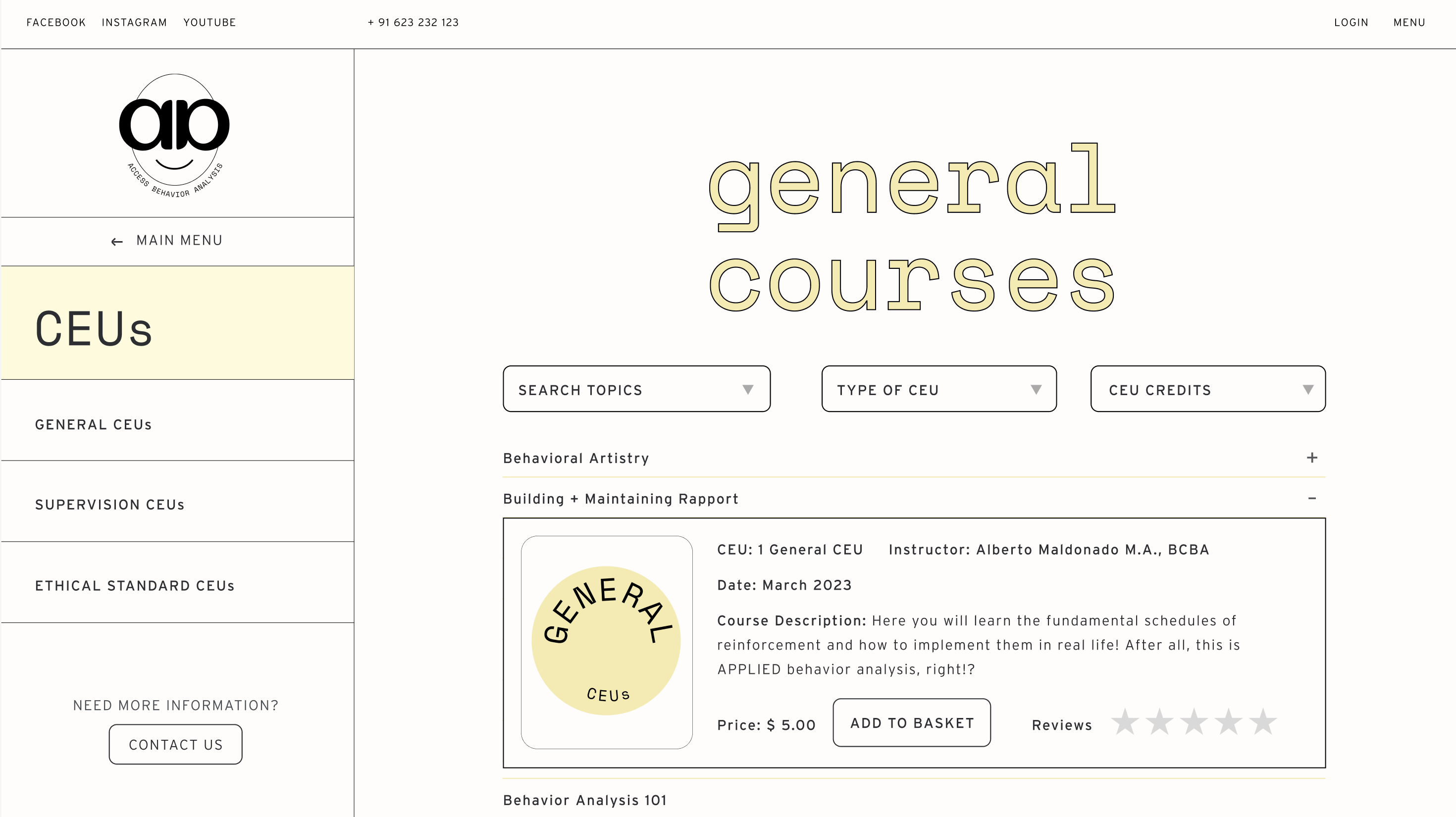
I designed this menu keeping in mind that users’ need to access to list of courses quickly but also be able to search for something specific along with being able to open out the all details for the courses as soon as they want to know more.
Easy to Navigate Courses via a List & Easy Search
I designed this menu keeping in mind that users’ need to access to list of courses quickly but also be able to search for something specific along with being able to open out the all details for the courses as soon as they want to know more.

#Feature 02
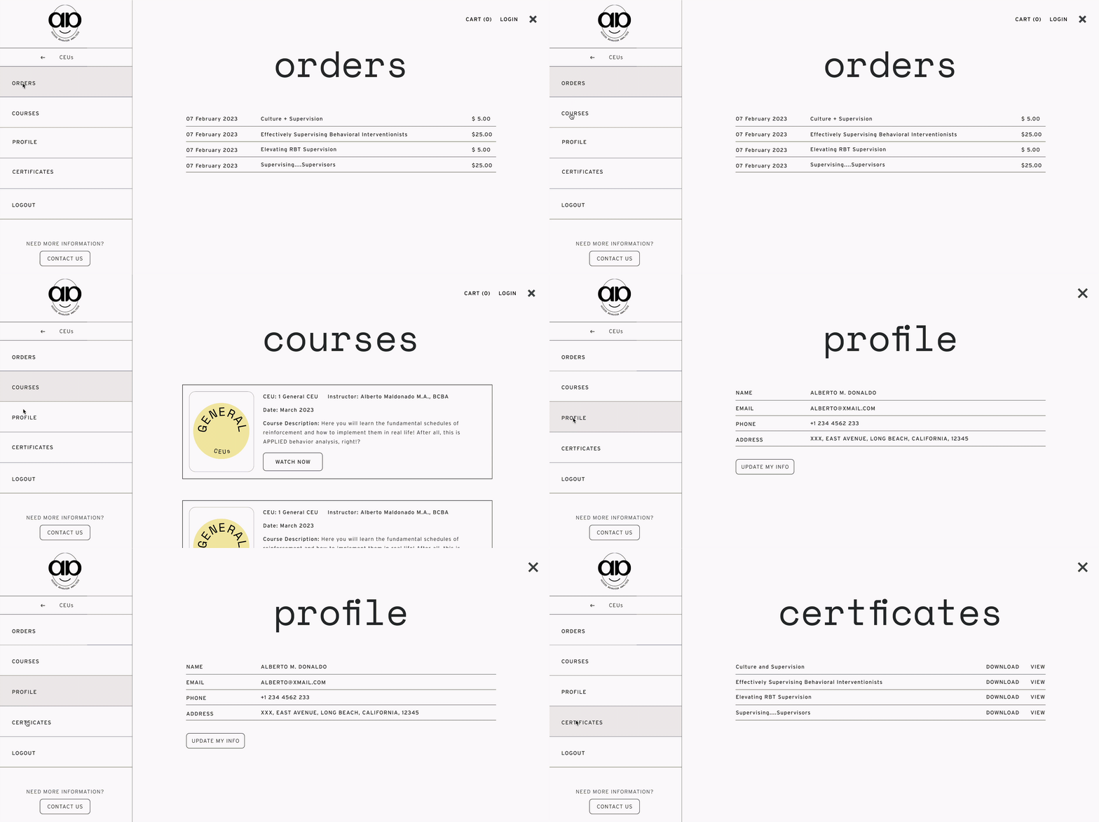
We designed a customer dashboard section that stores client details, displays purchases, provides access to study courses, and showcases respective certificates.
Organised Customer Dashboard
We designed a customer dashboard section that stores client details, displays purchases, provides access to study courses, and showcases respective certificates.

#Feature 03
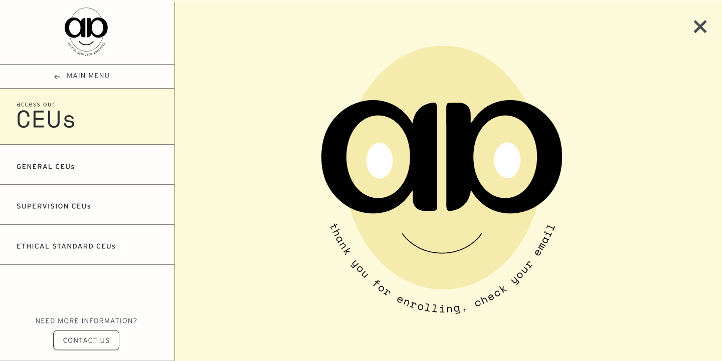
We designed really clean playful illustrations and added the same touch to through the copy as well. This helped to communicate our brand language.
Playful Copy
We designed really clean playful illustrations and added the same touch to through the copy as well. This helped to communicate our brand language.

#Feature 04
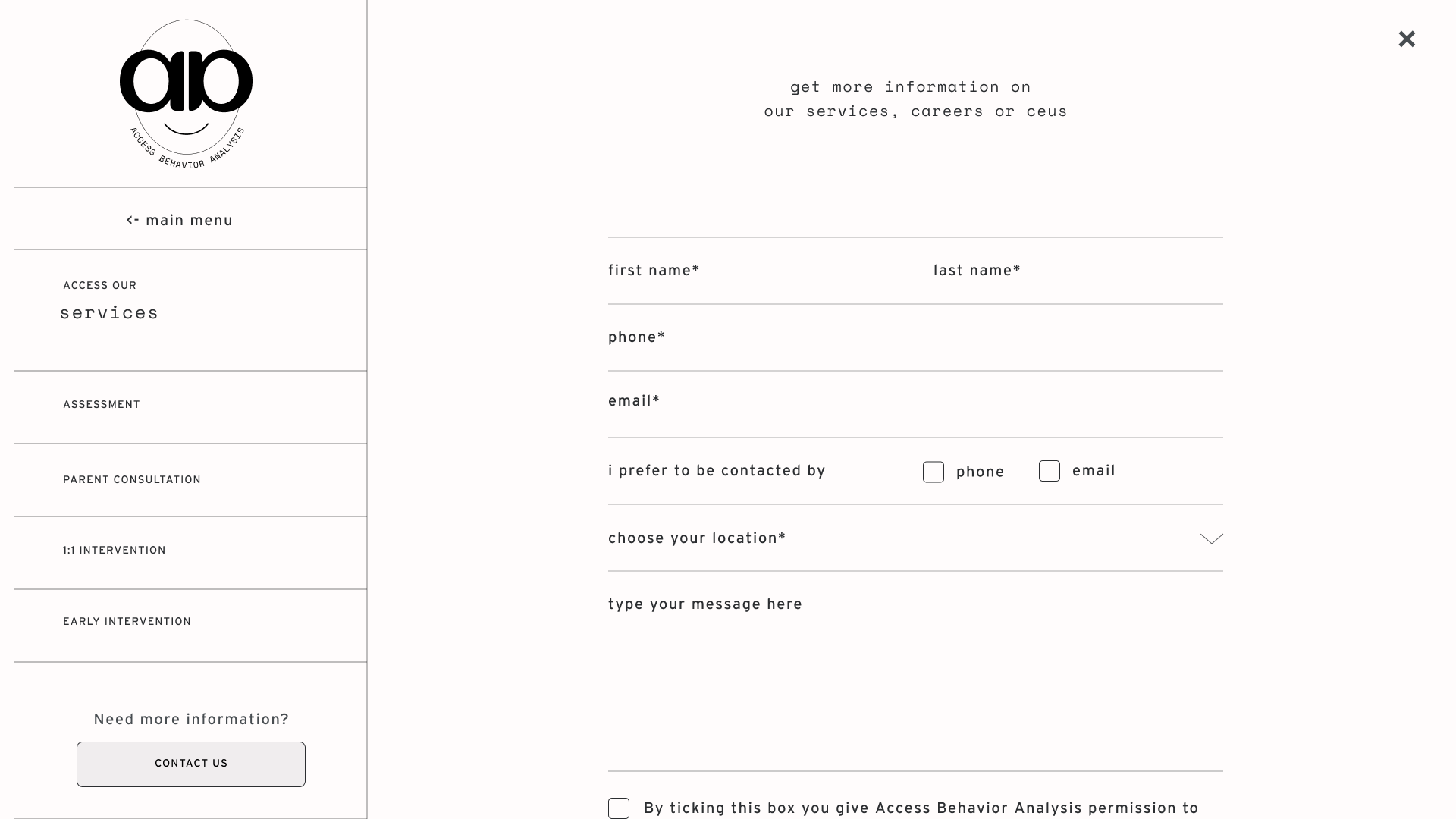
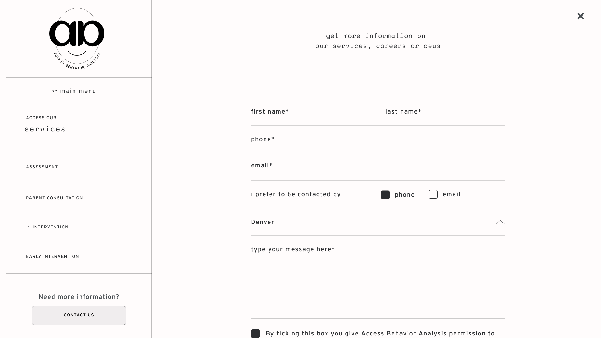
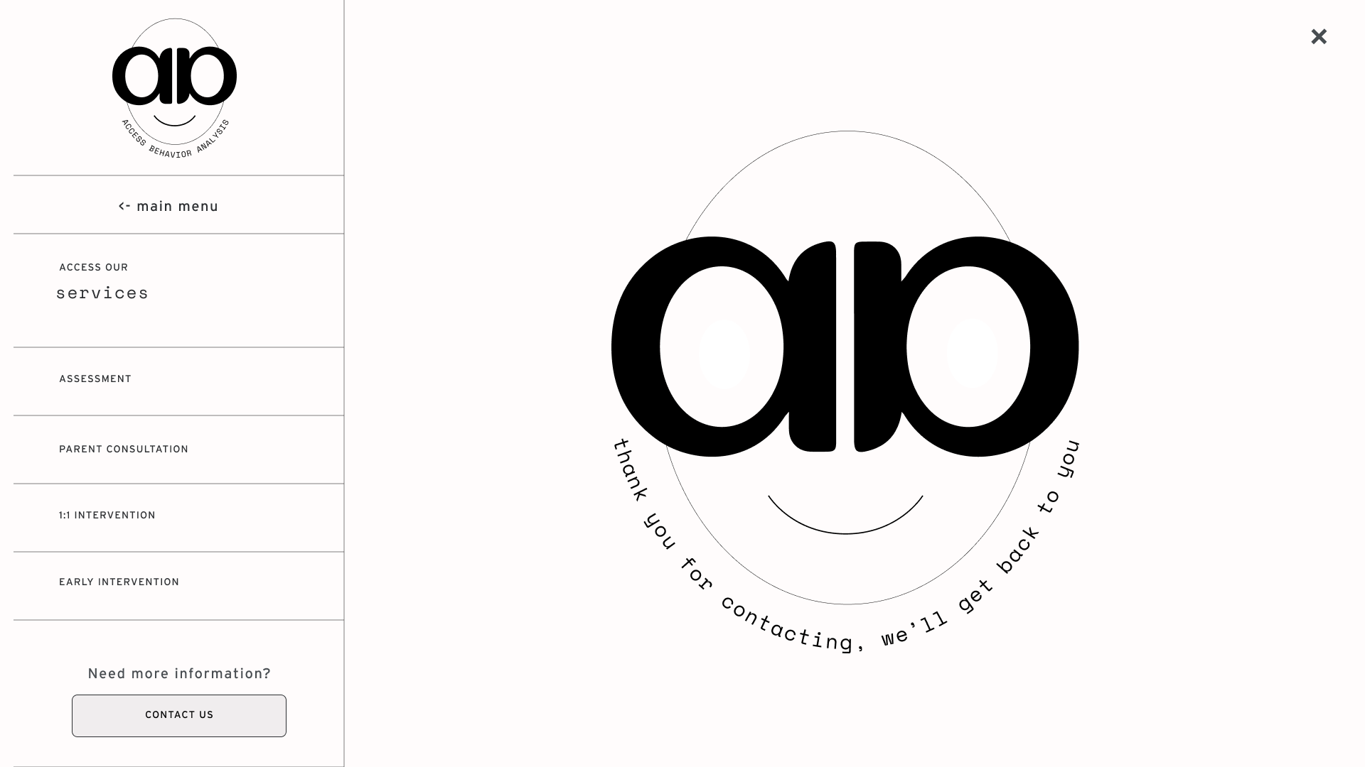
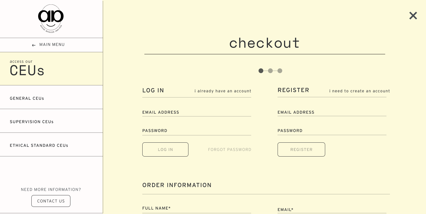
Form designs were an integral part of defining the vidual language becuase we wanted to ensure that these were not only extremely functional but also aestheically pleasing and had a delightful moment at the end.
Forms Design
Form designs were an integral part of defining the vidual language becuase we wanted to ensure that these were not only extremely functional but also aestheically pleasing and had a delightful moment at the end.

#Feature 05
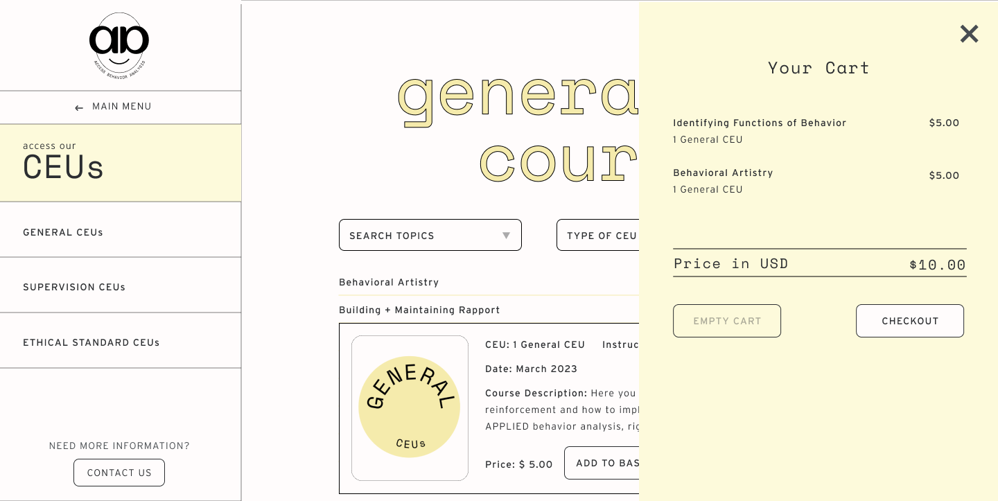
Clean, simple and color contrasted cart experience to create enough distinction.
Shopping Cart Flow
Clean, simple and color contrasted cart experience to create enough distinction.


05
Website
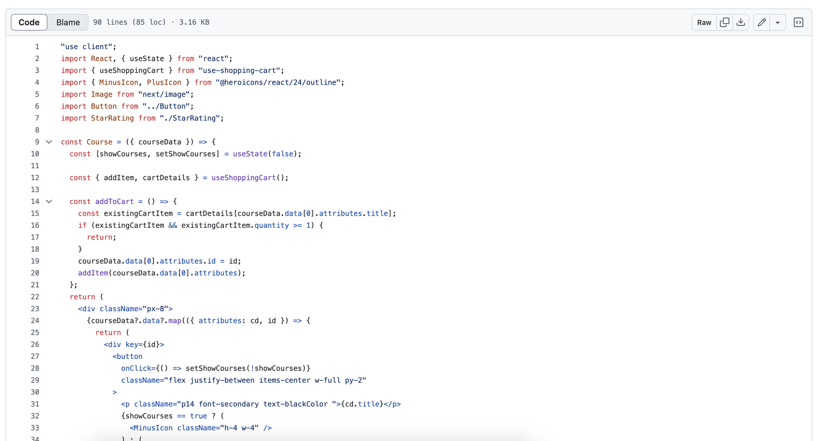
After incporating the feedback, we custom built the site using Next.js, Strapi CMS (Node.js) and Mysql.
Website
Development
After incporating the feedback, we custom built the site using Next.js, Strapi CMS (Node.js) and Mysql.
06
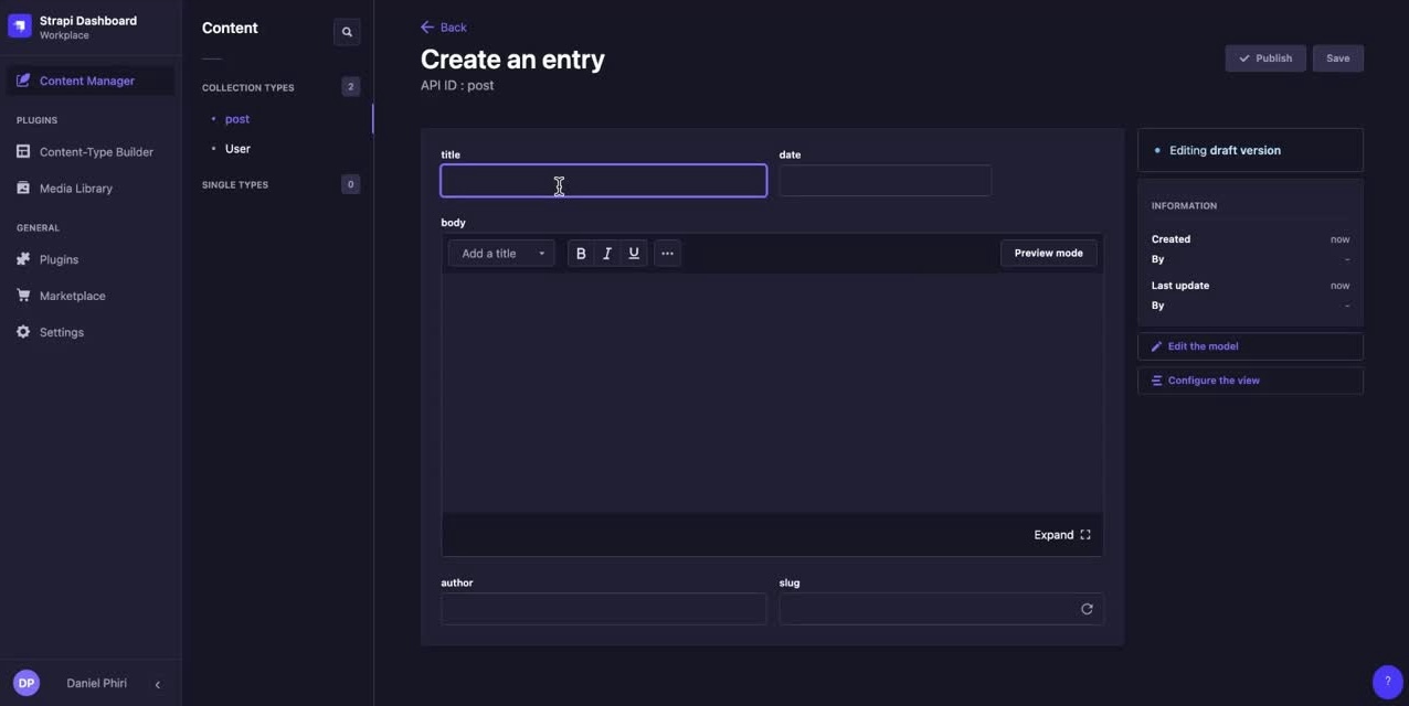
Backend For Updating the Site Seamlessly
To update the list of courses or edit, we developed a frontend database using Strapi CMS. Using this, the client could update the courses with details easily.
Backend For Updating the Site Seamlessly
To update the list of courses or edit, we developed a frontend database using Strapi CMS. Using this, the client could update the courses with details easily.
Reflections
Handling this scope of project was a challenging and insighful experience into designing and developing a site from scratch. Having said that, I’m very proud of what we achieved in the time. It has established a strong brand aesthetic for ABA as they expand their services on the site.
The most challenging part was planning the project since there were several details I had to account for from design to frontend and backend development.
It was really enjoyable to execute my vision for the brand and collaborate with developers when ideating for solutions.
The most challenging part was planning the project since there were several details I had to account for from design to frontend and backend development.
It was really enjoyable to execute my vision for the brand and collaborate with developers when ideating for solutions.