4° / Brand Strategy, Logo, Identity, Packaging, Guidelines & Website Design
A unique approach to resonate with target audiences
Requirement
How can we repackage greek yogurt to younger adults that are looking for natural desserts?
How can we repackage greek yogurt to younger adults that are looking for natural desserts?
Solution
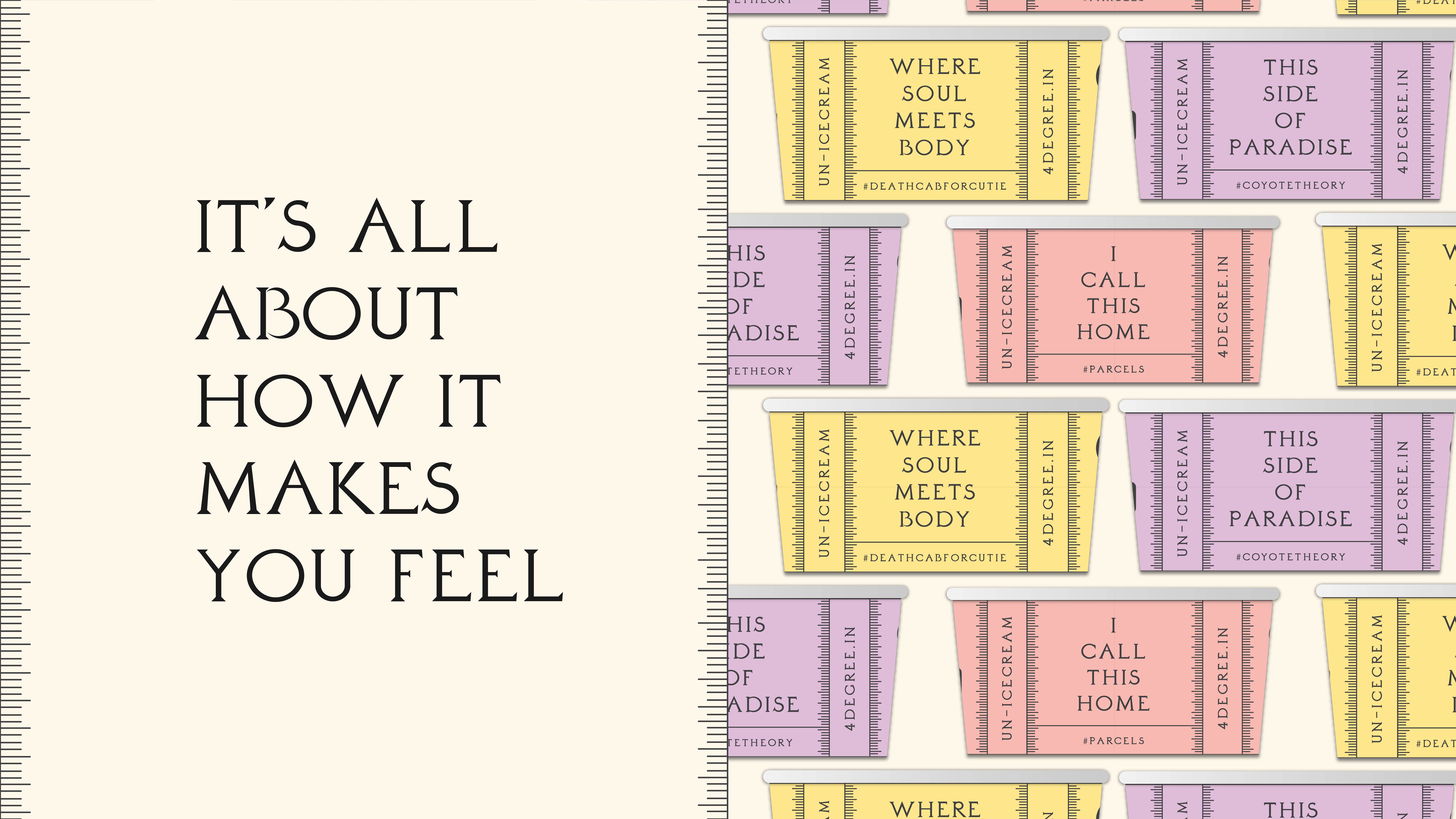
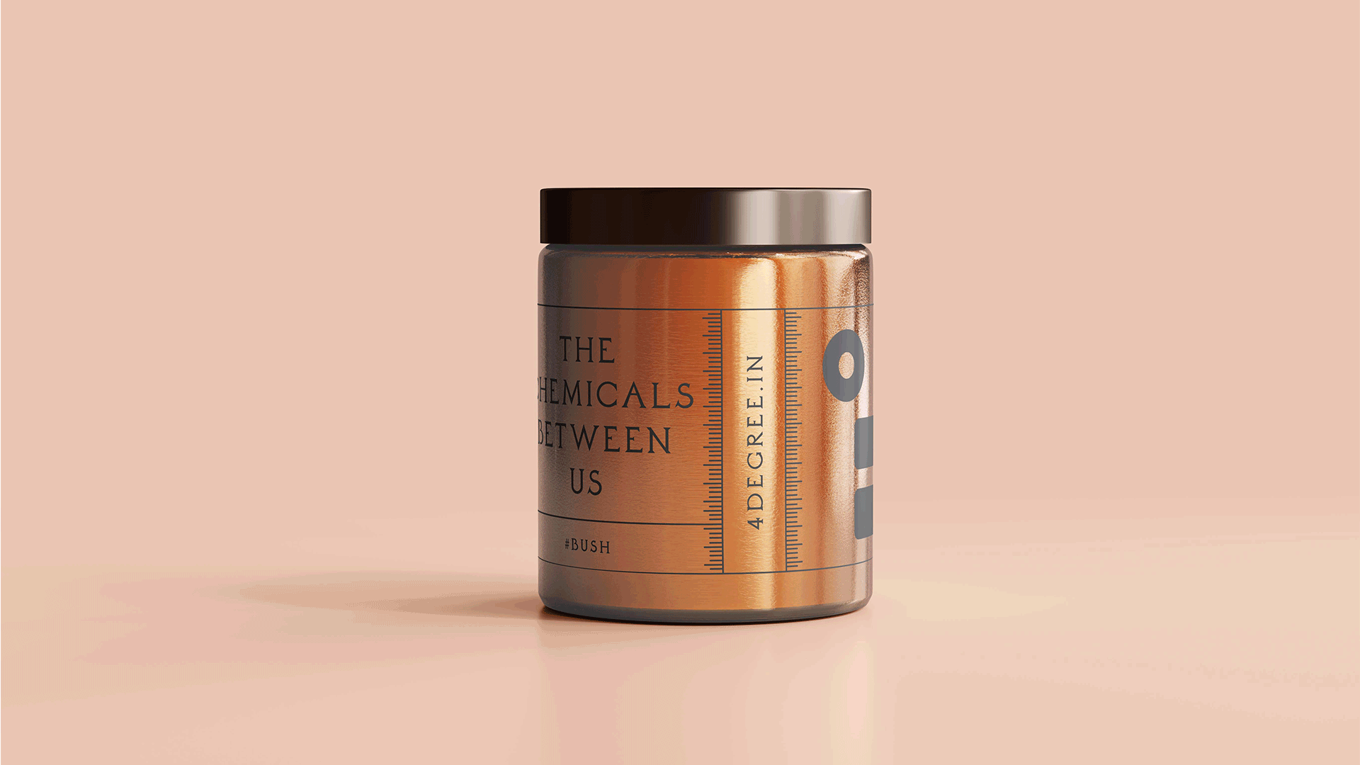
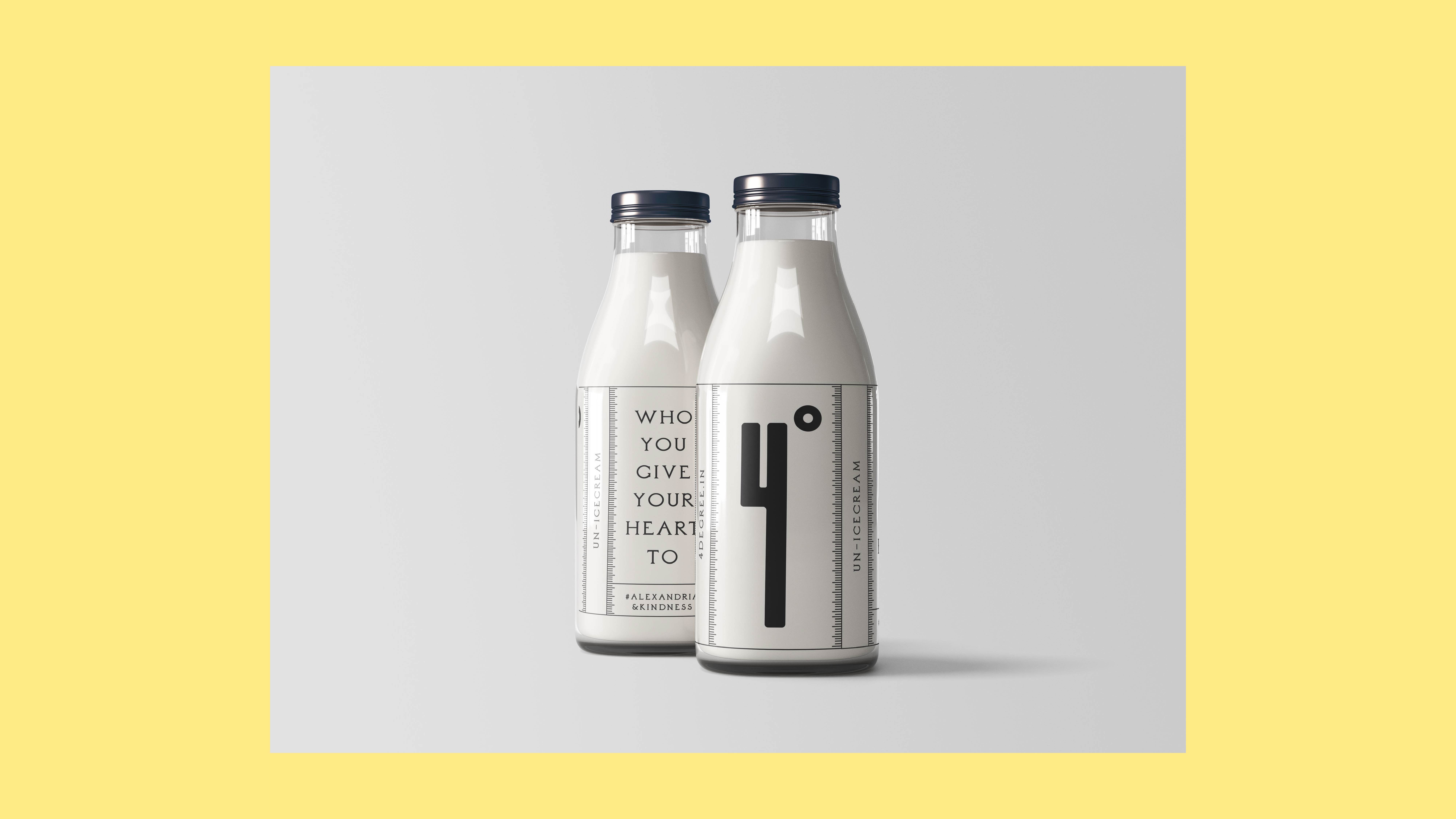
4° reflects something fresh, playful yet modern in the Indian market.
To bring the brand together, I worked on brand naming
strategy, identity and logo, packaging, website
photography and brand guideline.
Fun Fact: The length of logo was inspired by the long time consuming process of making the yogurt while the simple shape of the 4 is also inspired by the letter Y (which stands for yogurt in this case).
Role
Founding Designer
Founding Designer
Project type
Freelance
Freelance
Timeline
4 Months
4 Months
Software
Adobe Creative Suite, Figma
Adobe Creative Suite, Figma
Context
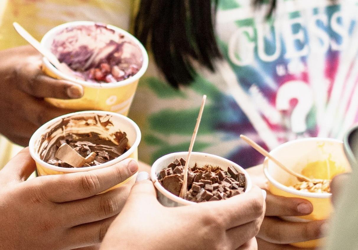
4° makes makes yogurt based desserts and serves it at the optimum temperature of 4 degrees. Not only is great for health but also great in taste, their quality desserts are made using only natural ingredients and follow the traditional Greek yogurt recipe.
Even though made traditionally, 4° brings a twist to the traditional way of eating high sugar and carb dense desserts. They are innovative in their approach intriguing in their style yet simple in their process.
Impact
*Conducted qualitative and quantitative research with 200+ target users to validate product-market fit.
*Streamlined brand strategy by creating a cohesive identity, a comprehensive guideline document, and 10+ launch marketing assets including in-store menu and packaging.
* Led social media strategy producing 30+ posts, categorising content buckets for regular creation and enabling organic growth of 1000+ followers in the first month.
*Achieved 45% revenue above forecast in Q1.
Brand identity, logo, packaging, website